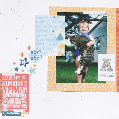
This page is a good example of needing to take a step back from the table and see what's really happening on the page. The page is ok- but that red 3x4 card is overwhelming everything... it's the first thing your eye goes to on the page... and that wasn't my intention at all. The page design is still fine but both the both colour and the visual weight created by all that text makes it not such a good choice to take that spot.
I swapped the cards around just roughly using photoshop and I think you can see the difference it makes to the page... the card is still visually heavy - but now it balances with my photo and and by adding the smaller word stickers around the edges it lightens up. Plus the lighter blue of the journalling card doesn't steal the show from the photo. I could go and change the page for real... but I think I'll just leave it and try and be a bit more mindful next time. The easiest way to do this is to walk away from my page for a few minutes before I stick it down and then come back and see where the first place my eye goes to on the page... if it's not where I wanted it to land (normally my photo) then I need to change things up a bit.
Supplies used on this page: Bazzill white cardstock, Cocoa Vanilla- You Rock!; Papers: Random and In line. Embellishments: Enamel Shapes, Die Cut Ephemera, Accessory Stickers, Chipboard Accent Stickers. Kaisermist Denim. Washi Tape: WRMK Pomegranate.


No comments:
Post a Comment