Showing posts with label tutorial. Show all posts

Monday, 23 August 2021

Techniques to use on chipboard

Good morning

A week or so ago on the Facebook Chat page Jane asked 

"Re: chipboard 
Do some of you paint it/ colour it in some way and if so how?" 

so today I want to share with you six ways I change
 the appearance of my chipboard to suit my layouts or cards.


Lets start with this one


The dragonfly chipboard I have used is from Memory Maze - Linda's Scribble and Butterflies
I have coated the dragonfly with glue and then sprinkled Dress My Crafts Frosted Sugar Powder all over it.
The arrow is from Memory Maze - Follow Your Dreams set. I coated it with white acrylic paint and then glue before covering it with white iridescent glitter.
The white paint certainly makes a difference to the finished look.

You could, of course, use any coloured paint under the Frosted Sugar Powder or glitter for a completely different look.

No. 2


Once again I have used a dragonfly from the Memory Maze - Linda's Scribble and Butterflies set.
This time I have given the chipboard a coat of black acrylic paint.
Once it was dry I used Uniquely Creatives Wavy Words stamp and Gold Ink
to stamp on top of the black paint.
If you liked you could add a coat of Glossy Accents or similar to give a high gloss finish to this technique.

No. 3


This chipboard is from Dusty Attics Mini Captions #2 set
I applied a solid cover of black acrylic paint and then a coat of Glossy Accents.

I love this technique for words and titles, it gives a high gloss domed look and 
looks fantastic on top of metallic paints too.

No. 4


The chipboard for this technique comes from Memory Maze - Card Sentiments 2

I used my Versamark Ink pad and white embossing powder to colour this piece. I actually gave it two coats of embossing powder so I got that nice smooth finish to the piece.
Once again this could be done in any colour.
Very fast and simple to do.

No 5


This chipboard comes from Memory Maze - Criss Cross Hearts

I applied a coat of Deco Foil Transfer Gel Duo, let that dry and then laid a sheet of 
Fab Foil in Gold on top of it and rolled over it with my brayer.

The foil did not stick to the whole surface but it has a very grunge modern look to it.

No. 6


The chipboard for this technique is from Memory Maze Wire Butterfly set.

I painted the butterfly with white acrylic paint and when it was dry I sprayed it with Glimmermist's Pumpkin Spice spray.

It has a beautiful shimmer in real life 

You could also add a layer of stamping between these two layers for added interest.

So there we have 6 way you could personalise your chipboard to suit your project. 
There are, of course, many many more.
I would love to hear or see your favourite ways of changing the look of your chipboard.

My process video is below.


Till next time
Stay safe
Hugs
Julie

Saturday, 24 April 2021

Black & Gold cards

Good morning

Today I want to share with you three cards I have made using the April theme of Black +1 

I have gone with Black + gold for this project


All of these cards are the same slimline size of 8.25" x 4" which fit nicely into our DL envelopes.

Each card has been cut from an A4 sheet of black 240gsm cardstock. 

I have cut the cards 8" x 8.25", scored and folded at 4" on the 8" edge. 

This leaves an off cut that is suitable to cut a 7.75" x 3.5" panel from to use as a front panel on each card.

Each card also has a gold mirror card panel that is 8" x 3.75" that is layered between the card base and the black cardstock panel.

The first two cards a very quick to create, the third card (a shaker) took a little more time but not that long really.

Let's start with this card
Card No. 1


I have applied DecoFoil Transfer Gel Duo through Studio Calico's Bubbles mask with my palette knife.

Once this had dried I laid a sheet of Fab Foil in gold over the top of it and burnished it using my brayer.

The sentiment has been heat embossed with gold embossing powder, trimmed and matted on some of the gold mirror board. This was attached to a piece of chipboard before being attached to the centre front of the card.

Card No. 2


The front panel for this card was run through my big shot with an embossing folder. I am not completely sure but I think this embossing folder is from Kaisercraft but any embossing folder will give the same results.

I then used my finger to apply a couple of light coats of Metallique Wax in White Gold to the raised areas of the panel. A few light coats is better than a heavy coat so the wax does not get down into the crevices of the embossed pattern.

The sentiment was once again heat embossed with gold embossing powder, matted with gold mirror card and attached to a piece of chipboard before being attached to the bottom right section of the card front.

Card No. 3


I used my Scan N Cut to cut 3 white panels and one black panel to create the window for the shaker compartments.

I layered these panels on top of each other with a sheet of acetate between the stack of white panels and the black panel which is at the top of the stack.

The gold mirror card panel was attached to the card base.

I then added a mixture of gold and black superfine glitter, on top of the gold cardstock, where the shaker windows would be and used a good amount of glue to attach the black panel on top of that. 

I used my Scan N Cut once again to cut gold circles to frame the shaker windows.
Once again the sentiment was stamped with Versamark Ink then heat embossed with gold embossing powder

Here is my video if you would like to watch these cards come together


Till next time
Stay safe
Hugs
Julie

Monday, 15 March 2021

Four of my Favourite Techniques to use with Stencils

Good morning

Today I have a quick post to share with you four of my favourite ways to use my stencils

There are dozens of ways to use stencils but these are the ones I enjoy and seem to use the most. I love adding texture and dimension to my projects.


I have made samplers to demonstrate these techniques. 
I cut a 12" x 12" piece of smooth white cardstock into 6" squares to use as my base. I will probably cut these up and use them on card projects in the future.

I clean my stencils as soon as I have finished each project because I do not want any of the product to dry on the stencil and make it harder to keep my stencil flat on future projects. 

To get a nice clean edge to your stencilling projects it is very important to make sure your stencil sits flat on your cardstock. 

I use a soft scrubbing brush and warm water in the sink to clean them. This could cause blockages in the plumbing if you are using your stencils continuously but I figure that for the number of time I use them I can probably get away with it. Time will tell I guess.

Starting from the left hand sample I have used Matisse Impasto Medium, which dries clear, and put that through my Kaisercraft "Textures" stencil. While the paste is still wet and in place I sprinkled Dress My Crafts Frosted Sugar Powder over it and pressed it into the medium using my brayer. The excess was tipped back into the bottle and the stencil removed. The Frosted Sugar Powder will not come off once the medium is dry as it has been firmly adhered. You could also use glitter, confetti and glass beads in the same way.

The second sample is using Colour Blast Colour Pastes through the same Kaisercraft stencil. The stencil is one of those that has 4 designs in the one 12" x 12" stencil.
This technique shows that you can use any paste with a stencil. Mostly I use Modelling Paste which I colour with acrylic paints to suit the project I am working on. Some other products that fit into the "Paste" category are Viva Inka Gold, Shimmerz Textures, Faber Castell Texture Luxe, Stencil Magic Paint Creme and BoBunny Glitter Paste, really anything that has a paste texture.

The third sample uses Deco Foil Transfer Gel Duo through Cadence MU-03 stencil.
I have applied the gel through the stencil and set it aside to dry. The gel goes on white and when it is dry it is clear. Once it is dry I laid Fab Foil, patterned side up, on top of the cardstock and ran my brayer over the foil to transfer the gold to the gel. There are lots of different colours and types of foil so the effects are unlimited really.

The final sample used Distress Oxide inks in Blueprint Sketch, Salty Ocean and Speckled Egg which I have applied through a Stencil Girl stencil using my blending brush. Once this had dried I stamped on top of the stencilling using StazOn Jet Black ink and a Kaszazz Stamp called "Reason Season Lifetime" before I removed the stencil. You could use any stamp here.

So there we have a few tips for using your stencils.

Here is the video that shows my process.


I hope you have found this informative and you try some of these techniques on your next project.
I would love to see or hear about your favourite stencil techniques. I love trying new things so leave me a comment.

Till next time
Stay safe
Hugs
Julie


Monday, 1 March 2021

March Challenges


This month we are playing with Fire & Ice!!


Challenge 1

Hello hello

Today I am sharing the layout I have created for the March  challenge.

As you can see the theme for this month is Fire & Ice so I have chosen to scrap some photos from our 2015 holiday to New Zealand. One of the places we visited was Tasman Glacier, so lots of ice in these photos.

My challenge for you this month is to use torn papers and the colour blue on your layout.

The torn papers on my layout are to give the impression of waves on the water.

 I embossed some Navy cardstock with my Kaisercraft Diamond Tiled embossing folder and then rubbed some Art Alchemy Metallique wax over the top of the cardstock so the wax adhered to the risen sections of the card
The colour I used was White Gold
I attached a 1" strip of this to both the top and bottom of the white cardstock I used for the background.

The papers I have used for this layout are from Pink Paislee's Indigo and Ivy range

I have torn strips of paper's No 4, 6, 7 and 10 so they were about 1/2" wide, inked the torn edge and the two side edges and layered them at both the bottom and top of the layout, tucking each new layer under the previous one.


Another way I used the Art Alchemy Metallique Wax was on some resin pieces from my stash. I coated them with some acrylic paint to match the colours in the patterned papers then used my finger to apply the wax to the top surfaces of the resin.

A chipboard tab from Dusty Attics Mini Tabs #2 set was left in its natural state and added to the left hand edge of the top photo.

The title, which is the name of the place and the date the photos were taken was printed from my computer and attached to the back of the resin frame.


You can watch the process video here if you would like

Till next time

Stay safe
Hugs
Julie


Challenge 2

Hi Craft Friends


Louise here sharing my challenge for March ...


Use this moodboard to inspire you.

Maybe it's the colours (Red, pink, orange or yellow), maybe it's a fireworks photo you want to scrap, maybe you have a gorgeous autumn themed photo you love.

Moodboards are all about choosing your own inspiration.

I'll have my inspiration page up soon :) 

Happy Scrapping


Challenge info...

Due date is the 31st March 2021 Midnight, to be eligible for the prize please make sure you have uploaded in to the correct album.

Facebook Albums - Here
Chat Page - Here

The prize is by random draw.

· International entries are very welcome, however, due to international postage cost, a smaller prize will be posted.

Australian residents, this month’s prize is a:

Chipboard, Paint & Bling Kit.

Please share with your scrappy friends...

Happy Scrapping everyone! 


Monday, 21 September 2020

Hi there.

A very quick post today to share one of my favourite background techniques.

All you need to make this is a few sprays, I used Glimmermists, and some Gladwrap (plastic wrap).


The longest part of this procedure is waiting for the sprays to dry.

The video below shows you just how easy it is to achieve these beautiful results.

Here are a couple of layouts I created in 2016 using this technique to create the backgrounds.

You can see I have used multiple colours on these background but the technique is the same.


I hope you give this a try, it is well worth it and very easy.

Till next time
Julie

Monday, 1 June 2020

How I kit... part 1

When I am heading away for a weekend retreat I like to sort out a bunch of pages ahead of time paper wise for a few reasons.

1. It helps me use up my stash.
2. It means I don't have to take much more than I need- and will only need to buy a few papers- and can use my spending money on embellishments rather than patterned paper (which I have a lot of already).
3. Batch tasking like this saves a HEAP of time. A big part of any LO is choosing the supplies- If I can go through and choose the papers for forty layouts all in one session then I only have to go through my stash once- not forty times!!
4. Having all sorts of choices already sorted for me means I can do what takes my fancy and I can get into it fast.

*************************************

When I kit like this I start from two different places depending on my mood.

Option One: This is the stash buster option I go through my patterned papers and find the ones I have had for quite a while, as well as some that I absolutely love and really want to scrap with and lay them out ALL over my lounge room floor.


Option Two: I go through my photos and find some that I am 'in the mood' to scrap then I lay them all out as below.

(Option three is a bit of both- in which case I do the papers first).


Step two in both processes is to match 'this with that'. So if I have paper all over my floor I will pull out my envelopes of enlargements, and my albums of photos waiting to be scrapped and find the matches.

I am looking for colour matches contrasting or complementary- not the same colour. Or thematic matches. If I find more than one paper option I will add them both. I may or may not use them both in the final LO but at least I have the paper with me to chose from and not back at home where it's going to be useless.

Here are some examples...

 The brown tones in this image is a good match with the greens in my photo and a few of the butterflies pick up the red of the table. This works thematically because the butterflies go to fun and outdoors.

The spooky paper is great with the witchy photos- the tan is neutral and will work with most things and the orange highlights are also found in my pictures.


The colours here work with my photos and the circles echo the ball in the image. You can see a similarly toned paper in the background which has chevrons- these will give the illusion of movement- I'll point them in the same direction the ball is moving in.

Arrows work with these images for the movement theme again. There isn't too much bright colour or bust details in my photo so this relatively colourful and busy paper with pair nicely.

A science-themed paper to match the science experiment in the photos.

This one is all about the colours.

This one is about colour too- I can see that these colours will work with my sons green shirt because that green is already in the paper. The pictures are quite bold so I have chosen a soft paper so there's no competition.

This is a paper I have had for ages and really like but found hard to match- but it works well with the sheets and picks up the pinks in the quilt cover. It contrasts nicely with my daughters green top.


Once I have complete sets of paper and photos I have a think about what I know is in my stash that will work well with what I have going on and go grab it...


I knew I had these Pirate Stickers from the same paper range the flag paper came from.

I knew I had some paper with cereal boxes for my baby eating cereal page.


The next stage is to go through my scrap paper drawers. These are sorted by colour and I pull each one out in turn and go through them to see if I have some papers to co-ordinate with what I have going on. Once again I am looking for colours and patterns that compliment or contrast...


Here's the final result. I didn't find matches from the scrap drawers for all of the pages but some of the offcuts from what I have already might work- because it's pretty unusual for me to use a full 12x12 sheet on a LO. Or I might buy a sheet or two while I am away. (I scrap at Country Paper Craft in Bruce Rock- it's a store and a retreat.) 

The final stage before I put it all away is to add a sheet of cardstock to each set. 98% of the time that will be White or French Vanilla. Very rarely I might use Black (Raven), Kraft, Chocolate, or Grey. 

Then I slip it all into, what ends up being a very full, Work-in-Progress Album- if you don't own one I highly recommend them. When I get to the retreat I flip through and pick the page I want to work on and pull all my bits out and get straight into it. When the page is done I slip it back into it's spot in the album for safe transport home.


Sunday, 31 January 2016

Heart Garland Tutorial ~ Crate Paper Fourteen ♥


Inspired by this heart Garland at Ikea I decided I wanted to do something more my style in time for Valentines day.
First- up I chose my papers from the Crate Paper Fourteen Range at Mystical.
 Grabbed some additional supplies: Craftworkz Twine (I used a mixture of colours but you could use just one), Glue Dots, eyelets and mini staples.


To make a Garland like this approx 3.5 metres long you need: 9 large Hearts (8.5cmW x9cmH ), 8 medium hearts (7cm x 7cm ), and 32 mini hearts (2cmW x 1.9cmH ) and 4.2m of twine (18 lengths of 23cm).

 I used a nesting die set on the sizzix but alternatively you could print 3 different sized hearts on the computer onto card to make templates to trace and cut. Because I wanted to get the most from my card I cut four hearts with each cut and used the spares on other projects.
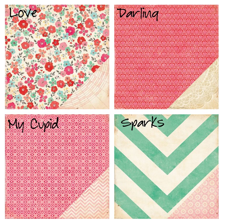
I used one half of each 12x12 and cut the 6x12's down into three 6x4 sheets to die cut.

Be still my heart! :-) 

I punched a hole on each side of the hearts and then laid them on the floor large-medium large etc in a semi random order.

I tried to keep the two darker pinks separated.

I then added coordinated but contrasting eyelets to each heart for extra strength.

I placed a large glue dot on a small heart and then pressed the centre of my 23cm twine lengths into 
the glue dot.  


 Threaded the two ends of the twine into my hearts and then pressed the ends into the glue dot.

Placed another small heart on top and sandwiched  them together.

And then added two staples for extra strength. I chose to do it this way because I want to be able to hang the garland across a room and have it look good from both sides. You could just skip the mini hearts and tie the twine in a neat bow. Or if you only want to hang it on a wall just use one length of twine running it behind the hearts and tape it in place so the hearts don't move.


 Further ideas... 
  • It would be nice to add a string of hearts hanging vertically on each end of the garland.
  • You could embellish the hearts with the smaller hearts in a contrasting colour.
  • You could embellish the hearts with large letters to spell out a name or message.
  • You could embellish the hearts with anything that made your heart content.
  • You could make it to coordinate with the colour theme of a wedding or a babies room. 
I think we'll pull this one out on Birthdays as well as Valentines each year- and the colours would look too bad at Christmas either.

If you make one please be sure to share it in the gallery.

♥ ♥ ♥ ♥ ♥ ♥ ♥ ♥ ♥