June Cybercrop
Hi Crafters
Louise sharing for the June Cybercrop.
Your challenge is to use multiple triangles (more than one, but as many as you like).
I've used Cocoa Vanilla Studio "Sunkissed" papers and foam title.
I started the layout as a 9x12 but added that to some black cardstock.
The washi tape was from my stash ... featuring triangles of course!
Finally I've added some triangle enamel dots.
I can't wait to see your triangle inspiration.
Happy Scrapping.
***
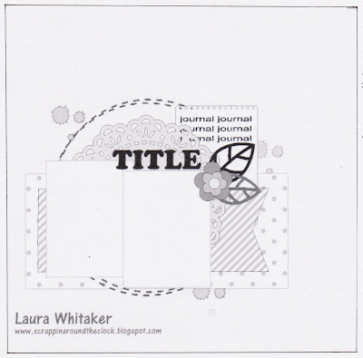
Good morning Julie here with my challenge to you for the June Cyber Crop.
I would like you to create a layout inspired by this sketch.
Here is my layout
I have used Cocoa Vanilla's Daydream paper range for this layout.
The background is White Cardstock
All of the papers have had the edges inked using a Kaisercraft ink cube, colour Bark.
I started by giving my Dusty Attic - Start Banner chipboard a coat of acrylic paint. The colour is Goldenrod which is a mustardy yellow. When the paint was dry I added a coat of the Gold glimmer pen from Uniquely Creative.
My 8" x 6" photo was matted on a piece of 8.25" x 6.25" coordinating cardstock
I cut Cocoa Vanilla - Daydream - Stepping stones to 10.5" x 6.5"
and Cocoa Vanilla - Daydream - Garden Variety to 5.5" x 10.75". I cut a fishtail into one of the narrower ends of the Garden Variety paper.
I tore two thin strips of the Stepping Stones paper
I have attached the papers using double sided tape and the chipboard using glue.
To embellish the layout I have fussy cut three flower clusters from the Garden Variety paper and items from the Cocoa Vanilla Daydream sticker sheet.
I used a bread & butter plate from my dinner set to draw the faux stitched partial circles above and below the patterned papers.
I also added faux stitching to all of the patterned papers, chipboard and sticker embellishments
The title was cut from the same cardstock I used to mat my photo using my Scan N Cut. I inked the edges, attached it to the bottom section of the layout and added faux stitching.
I have adjusted the sketch to accommodate my larger photo, I have added the torn paper at the top and bottom of the layout and I have also added the chipboard banner to the top of the layout. I moved the title to the bottom of the layout because it would look too cramped at the top with all of the other things I have added there. I also deleted the doily for the same reason.
Here is my process video if you would like to watch it.
Thank you for spending part of your day here with me today
Till next time
Stay safe
Hugs
Julie


No comments:
Post a Comment