Saturday, 30 April 2016

DT Share ~ 4 Little Bears


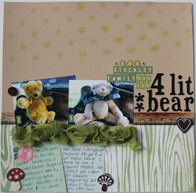
In the spirit of our month of journalling I chose to scrap these pictures that were waiting to have their story told. We have a history of pregnancy loss in our family and many years ago started a tradition of conception bears- given both to mark a loss or as a little mascot to hopefully safeguard a new pregnancy.

Supplies used: Core'dinations: Coconut Cream, Fancy Pants: Family Album, Echo Park: Apron Strings, Kaiser Mist Lime Green, 6x6 Crafters Workshop Template (this Kaiser mask would also work well for this), Washi Tape, Thickers- Iguana Black, October Afternoon Mini Mart Alpha, Kaiser Resin Blossoms, Kaiser Rhinestones. The flower ribbon is from my own stash- but you could do something similar with some of the lovely Green Tara range of flowers.

Design School ~ Contrast

The dictionary defines contrast as "the state of being strikingly different from something else in juxtaposition or close association." 

Contrast is great way to add visual interest to your page and draw the eye into/through the page. 


You can use contrast in big and small ways on your scrapbook pages to create impact.
  • Using contrasting colours. (black/white, blue/orange, green/red etc)
  • Contrast lots of one dominant colour with smaller touches of a contrasting colour.
  • A bright colour with a neutral background.
  • Contrasting sizes in your fonts, pictures and other elements. Eg. One large photo with a group of smaller ones.
  • Enlarging some of the key words in your journalling to contrast with the rest of the text.
  • Contrasting fonts/alphabets in your title 
  • Contrasting the text in your title with the text in your journalling
  • Bold patterns and plain papers
  • Using different scales in the size of your elements. 
  • Contrasting shapes eg using a circle element on a page full of rectangles and squares.
  • Contrasting a busier section of your page with an area of white space. 


I've used contrast in my title on this page. My text is both big and small, dark and light, a thin plain font and a fancy script font- with the emphasis on the word 'shorter' which is the main focus of the subject of my page. I also have the contrast of the plain light background at the top and the darker patterned paper at the bottom.


This page I've contrasted the size of my before and after photos- to give the emphasis to the new hair style. The bottom half of the page is darker which makes it heavier pulling your attention to it.


I've contrasted my photos again on this page by taking the colour out of my before photos.


I've contrasted a shaped patterned paper with a plain rectangular section at the top to draw attention to my title. I've used a larger scale half circle behind my title and a smaller scale half circle down the bottom of my page- the two elements relate to each other because they are the same shape- but the size difference provides and interesting contrast.


Click on the image above to see it larger- and see if the contrasts pop out to you.

 On this page I've used contrasting colours. I've contrasted the styles of text in my title. And I've contrasted the large 'bug' element on my page with some smaller more stylised bugs to add interest. The large bug also draws your attention to my title which is what I wanted to emphasise. 

 I could have chosen this rainbow patterned paper for this page about my son's crazy hair style- it works fine on the page.


 But I prefer the contrast of the white space with the bright splatters they bring some contrast and movement to the page.

Take a look at some of your favourite pages in the gallery or on pinterest to see where the scrapbookers have used contrast to add interest to their layouts. And don't be afraid to go big using contrast on your pages.

Thursday, 28 April 2016

In with the old ~ I love my MJ's


Yes I'm scrapbooking my favourite shoes! It tells a little story about me and my history- and sometimes I think these small details are great memory triggers- like my grandfathers cardigans, and the way my grandma made me a lettuce and salmon sandwich- tiny memories which make me happy.

This week I'm just using a strip of the scalloped polka dot 1 KI Sheer delights with my April Kit. I chose this one because it repeats the shape of the toes of my shoes and the dots reflect pattern on the toes. It's a subtle detail- but it's all the little things go into creating your overall page. 

Supplies used: KI Memories Sheer Delights Polka 1, Echo Park For the Record: Lace Strips and Table Cloth. Bazzil Cardstock White, Washi Tape, Thickers- Iguana Black, October Afternoon Mini Mart Alphas, Prima Flowers and Kaisercraft Resin Blossoms.

Tuesday, 26 April 2016

DT Share ~ Dear Will


Hey all, I am back again with another LO from my April Kit. I've written a little letter which I have placed in the envelope for Will about some things I remember about him at this age. I think at first glance that the Fancy Pants Memories Captured line doesn't really say 'baby LO' but there are definitely some papers that are just perfect! :-)

I don't usually cut my photos in circles but thought is might be fun for a change. I used a circle die that was slightly larger than my photos but simply hid the flat edge under the neighbouring photos. 

I've used Fancy Pants Memories Captured: Memories, and Snapshots. As well as the FP Memories Captured Envelopes, Carta Bella Rustic Elegance alpha stickers, Cocoa Vanilla Totally Rad Acetate Stars, Kaisercraft Rhinestones, and Washi Tape.


Sunday, 24 April 2016

Gallery Pick


It's great to see some inspiration from Donna's Sketch for the first April challenge in the gallery- there's still time for you to play along too!

This page is by DebW. I think the mix of traditional Christmas Colours with the blue background is a great combination. The Stocking banner in the corner is a neat little touch. And tucking the journalling on a card in behind the photo is a great idea. Deb's embellishment add perfectly to the feeling of the page without overwhelming the photo.

Great LO Deb! Thanks for sharing!

Saturday, 23 April 2016

Cyber- crop "The Days are long..."


One of the blogs that I have enjoyed reading is The Happiness Project. On it the author Gretchen Rubin has a short two minute video called 'The days are long but the years are short'. In which she describes how our everyday life is super important. It's a message that's stuck with me since I first saw it four years ago- I often remind myself when we are going through a tough season in our life- The days are long but the years are short. So it was the perfect quote to use with these fun photos of Kieran on his very first and very last day of school.


On this LO I've used: Bazzill Cardstock White, Cocoa Vanilla Totally Rad Mix Tape,  AC Thickers Iguana Black, Kaisercraft Rhinestones Black, Wood grain Washi Tape, and a Twiddleybitz Roman Clock which I have heat embossed.

Friday, 22 April 2016

April Cyber Crop Challenge- Words, words, words


Hello all,

Welcome to the April CyberCrop. This month is all about telling your story! And it's a little bit different, in that you get to choose your challenges- and you can do as few or as many as you want.

I find when I look back the pages I love the best are the ones where I have really taken the time to tell a thoughtful story in an interesting way. This month I want you to really think about how you can create journalling that will help you accurately tell a story and give meaningful information in a fun or interesting way. You'll find below a list of 10 ideas for different ways to journal on your LO's with some examples of some from the DT and some older LO's of mine. You can choose which methods you want have a go at. The example are just that- you don't have to use my ideas- but you can if you want.

1. List- use bullet points, numbers or some thing else to create a list on your page eg a list of names someone gets called, a list of countries you've visited, a list your favourite things to ea, or a list of things you want to remember.


2. Letter- write your journalling as a letter to yourself or someone else. You could put it on the page or enclose it in an envelope on your page.


3. Conversation- Have you recorded a funny or interesting conversation between two or more people? Maybe it's a series of texts on your phone? Use the conversation as the journalling on your page.

4. Highlight words- scrapbook your journalling in such a way that you highlight key words in the story. You can use stickers, word strips popped up, colour, bold text, or something else that you imagine up.

5. Infographics- Infographics use a combination of simple images and a small amount of words and/or numbers to get a message across. Here's an infographic about our family I created digitally for our 2014 Christmas Letter.


6. Recipe Share a recipe on your page- maybe it's one your family loves, or something your Grandmother made, the recipe for your wedding cake or maybe a recipe you make up. For example the recipe for a perfect man/child/friend or the recipe for a great day- no one said it had to be food. :-)

7. Lyrics or Poem- Is there a song or poem that you relate to a certain event, person or time- use that to tell the story.

8. Quote- Use a quote as your journalling or to compliment the story you are telling.

9. Comparison- Make a page that compares two or more things. For example; here and there, then and now, brother and sister, husband and wife, two pets, your childhood and your children's. 


10. The News- Write your journalling as if you are writing a news article. This one is about my first day of school.


Now for our example pages, each DT member has chosen 1 journalling technique to use...


Gypsy here with my LO for this months Cyber Crop. I've used a poem by Lauris Edmond called 'Really...' it talks about a new baby.
I've used the Echo Park For the Record 
Fancy Floral and Apron Strings, Bazzill Cardstock, Kaisercraft Cream Lace, Maya Road Vintage Crochet Trim, Fancy Pants Memories Captured Envelopes stamped with distress ink, Fancy Pants Wonderful Day Alpha and Green Tara Damask Flower.


Hi :)  It's Kathy here. 
 I used a quote by Plato to help capture my daughter's love of music.  I used Doodlebug Hello Spring Rainbow Jellies and Baby Butterflies papers and Twiddleybitz Chipboard Cuts. The quote was created with 2 different styles of Thickers, Pink Paislee Hey Kid Element Stickers and some smaller stickers from my stash. I also added some Kaisercraft silver jewels.


Hello everyone, Donna here,
I've chosen the Highlight Words technique.  To create my page I used papers from Simple Story's, Life in Color range and some pieces from their Ephemera pack - , Bazzill white card - KaiserMists and Rhinestones and Prima flower.

I have highlight words some words but using different sizes, fonts and some are popped off the page with 3D foam.


   I tried a new product and technique too, well it's new to me, but it's been around in one form or another for a while now, and I've always been reluctant to try it....FOILS! 


OMGosh....I'm in love!!  I will do a blog post next week to show you how easy these are to use and how you can create your own gorgeous embellishments!


Have fun with these, I can't want to see your takes up in the gallery.   You have a week plus to upload your creations into the gallery- there is only one for this CC. 

Due date Sunday, 1st May - Midnight

**All layouts entered must be created for this CC.

We will be giving away 1 shopping voucher valued at $20.00, and each entry receives 1 ticket into the draw.....each challenge you do gives you a chance to win!

We will also have a surprise prize!!  Our DT members will chose their favourite over-all layout and I will send that lucky person a surprise in the mail.

Happy Scrapping.
Mystical Team

Thursday, 21 April 2016

In with the old ~ Hello You!


This week I am using the KI Memories Sheers and scraps from my April kit to make my page. I love that the sheers add some different texture and interest to the page.

Supplies used: KI Sheers: Houndstooth 1, Small Flower 2. Fancy Pants: Chalked, Family album.  Echo Park: Apron StringsTable Cloth Cocoa Vanilla: Top Gear. Bazzill Cardstock White, Foam thickers.


Tuesday, 19 April 2016

DT Share- BLW ~ Donna's Sketch challenge


Have you had a go at Donna's April Sketch Challenge yet? I'm using my April DT kit for this page and I've turned the sketch 180 degrees. I'd love to see what you've done in the gallery.

Here's what I used: Echo Park For the Record Lace Strips, Bazzill Cardstock, Fancy Pants Memories Captured Chalked Art, Doodlebug Snips and Snails, Thickers Letter Stickers, Cocoa Vanilla Totally Rad Little Stars, Kaisercraft Jewels, the strawberry stickers are from an older October Afternoon line.

Sunday, 17 April 2016

Design school ~ Don't put your emPHAsis on the wrong syLAble


Don't start scrolling till I say...


True confession time: these fun elements were in my February DT Kit- I pulled them all together when I was coming up with the mid-month challenge for March. This was one of my ideas that didn't make the cut. That said I did make the page intending to just share it with you for inspiration. But it's much better in this post because it's a great example of what not to do!

You're about to scroll down and look at the page I made... I'll invite you to have a think about where your eyes go first, second, third and then finally fourth.


Are you ready?

Think about what you're seeing..... 

Scroll down to see the whole page...

Here's the layout....

I'm guessing that you saw the elements in this order: 
  1. Good Stuff
  2. Let's make today amazing
  3. Today
  4. Photos
Not great huh? The page is about the photos- I want to put the spotlight on them. But by choosing to put these large elements like this on the page the way I have and also draw attention to them with the circles I have overwhelmed my images and sent them off into the background- the Emphasis is all wrong


The starting point for any LO should be the decision about where you want the emphasis to be. It won't always be the photos- have a look at these pages and see where the emphasis is and why...
The emphasis on this page is the journalling- I've used rhinestones to make strong bullet points to draw attention to each line of a text. The most important message on my page was in the words... so much so I don't even need a photo.


Here the emphasis is on the central photo- I've enlarged it and made my title and other elements lighter to help give the photos the spotlight.This page is about what was happening in the photos in this case they tell most of the story- the rest is in my journalling.


The word Radio in the title takes the stage on this page- because my page is about my memory of listening to story time on the radio as a child. I've set the word aside from the rest of the title to give even more attention to it. The photo is just illustrative of me at that time and doesn't get the main spotlight because it's there for decoration- I could have made the page without it.


The title on this page is a quote and I have put the emphasis on the most important words- you can read them alone and clearly get the message I am conveying. I could have chosen one of many everyday photos that I have taken for this page it didn't really matter- what I wanted to recognise in this page is that things change- so it's important to have the little details captured as they are part of the story. And in fact I don't have that car, or handbag any more. I no longer have a need to carry snacks for the boys as our habits have changed.  I don't go to that library any more and I finished that whole series of (Janet Evanovich books). It really is extraordinary just how much has changed since I took that image.

Emphasis thieves
Sometimes we know what the emphasis is on the page but in the process of making the page we can add elements that steal the emphasis.  
The emphasis for this LO is intended to be on the photos- by placing them together in a block I have given them a lot of visual weight. But I have a patterned paper at the top that is visually quite heavy busy and bright- what I see first is that paper.

It's hard to tell on this page which set of photos have the emphasis on them- by splitting them and making them smaller they lose their power.


In this LO by using a large dark title it definitely steals the focus- overwhelming everything on the page.


By using such a large piece of a busy paper  with it's own image I have once again drawn the attention away from my photos.


If your embellishments are too big or too contrasting with your emphasis point you'll overwhelm the layout. 


In this LO the photos take the stage but I haven't cropped them so your eyes are assaulted by the lights at the hairdressers or get drawn to the 'G' letters on the cupboard behind my daughter. If you can't crop a distracting item out of a photo try and see if it suits cover the item with your embellishing.


I've used a super heavy block font for my journalling on this LO and it's gained so much visual weight it's distracting.


On this page my title is a similar size as the other title but by using all capital letters for the title and the contrasting black and white I have once again drawn the eye to the title. Even if I had have done this in all white- it would still steal the attention.


So here's the final page- my photos have the attention directly on them. They aren't overwhelmed by any other item on the page. Obviously this page is digital- but if you are loving these supplies then you can find them in the store at Mystical- it's the Fancy Pants Memories Captured line which I also have in my kit this month.
We'll come back to this LO in future weeks and see why I made the other decisions I made for this page using the other design elements I talked about last time in design school. 

Saturday, 16 April 2016

DT Share- Op-Shop Chic


When I saw the colour of this Lime Green Kaiser Mist I knew exactly the photo it would work perfectly with. My oldest son and his friends decided to suit up to go on their final Outdoor Education Camp in Year 12. The four of them set out on a day of op-shopping to get kitted out.


I've pulled together a bunch of scraps to make this page- but it would also be a great design to make with papers from your 6x6 paper pads.

I used the Kaiser Mist to colour one of the patterned paper sheets, the white cardstock for my photo mat and of course as part of the background on my white Bazzill base sheet. You can see the technique I used to add the mist in this post from earlier in the week.

Supplies used: Papers: Pink Paislee Hey Kid: Double Dutch, Marco Polo (misted), Fancy Pants Wonderful day: Terrific, and Simple Stories Life in Colour Big Memories. Bazzill White cardstock, Thickers Iguana Black, Cocoa Vanilla Free Spirit Flairs, Jillibean Soup Labels: Card Sentiments2, Journalling 2 and Kaiser Mists Lime Green.

Friday, 15 April 2016

March Winners!

Hello everyone...Here is the list of our lucky March winners

Here's a recount of how our prize winners are chosen:
Our Monthly challenge winner is chosen via random draw - International entries are welcome, however due to international postage cost a Creative Design Spot will be offered along with a little surprise in the post.

Our Cyber Crop prizes are;  1 major prize of a $20.00 Mystical voucher via random draw, 
the more challenges you do the more tickets you get in the draw. 

And a ''DT Favourite'' prize which will be a surprise prize in the post.

Cyber Crop Winners...

$20.00 Shopping voucher goes too.... 
  • Sharnook - we all loved your design and colour combo!
    DT Favourite winner is..
    • Jules44 - 
    Bingo winner is
    • Mary 
    Guess What winner is

    • Karen 
    Girls there will be a surprise prize in the post for you...


    Monthly Challenge winner is..
    • kazikt - Loved your double layout!
    Karen has won a packet of Wonderful Day Brads and some bling from Kaisercraft

    Thank you to everyone that joined in and made our gallery look fabulous!  

    Thanks for join us
    Mystical Team

    DT Share ~ Life Goals at 6 Months


    A quick share from me today this Cocoa Vanilla Totally Rad Line was not in my Kit this month but I like it so much that I had to buy some and make a page as soon as possible. The story is about the mission that my son Will was on at six months to manage to get this toy in his mouth. He was very determined.

    Here's my supply list: From Cocoa Vanilla: Papers: Stellar and Top Gear Totally Rad Alphabet Stickers and Little Stars. The pick paper is LYB Clothesline Cora Chrysanthemum. I've also used the October Afternoon Mini Market Alphas, Crate paper Maggie Holmes Aperture, Simple Stories Enamel Dots and Kaiser Mist Charcoal.

    In with the old: Joy Mini Album


    This week for my Throwback Thursday I'm using my KI Memories Sheer Delights to make a mini album. I have participated in Ali Edwards One Little Word class for quite a few years now. One of my favourite activities is to make a mini-album to help highlight and remind me of my word for the year. This year my word is Joy and I decided to use the Sheers as my mini album base. 


    I simply took one sheet of the Pink Small flower Sheer and simply used my trimmer to cut it into quarters. I've stacked them and punched a hole in the corner to form my pages. I've hooked them all together with a book ring.


    I chose eight pictures of things that bring me joy and had them printed as 3x3inch photos with a white border.


    I've also added some cards from my stash that also sparked joy and added them in as additional pages.


    Then I've added some double sided paper scraps in behind my photos hiding the adhesive behind the photos which are positioned exactly back to back on each page.


    Finally I have added some embellishments that I have hoarded for a while because I really loved them! :-)  Put all the pages back on the ring and called it done. I've hung it up in my scraproom with a couple of mini albums from previous years where I can see it every day.